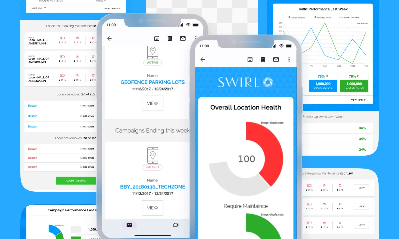
Most platforms in 2018 treated notification emails as a chore. A subject line, a button, a templated body, ship-it. The emails went out. Nobody opened them twice.
Swirl’s notification stack was no different — until I argued we should treat it as a product surface.
The setup
Admins had access to live campaign data inside the console. The console was the polished surface. The notification emails — your weekly campaign report is ready, your beacon health summary — were nested-table HTML with static screenshots already two weeks stale by the time they hit the inbox. Nobody clicked.
The data was already in the platform. The blocker wasn’t tech, and it wasn’t ops. It was that email was treated as out of scope for design. Most developers reach for a basic template and move on. I’d spent years coding high-converting emails before this, so giving up at the edges didn’t sit right.
The decision
Two bets, made at the same time.
Bet one: MJML. A new framework at the time — React-for-emails was the shorthand. Component-driven, responsive by default, compiled to the nested-table HTML that email clients still require under the hood. It let me build email layouts the same way the rest of the product was built — shared components, predictable spacing, a real type scale — instead of fighting Outlook through hand-written <table> tags.
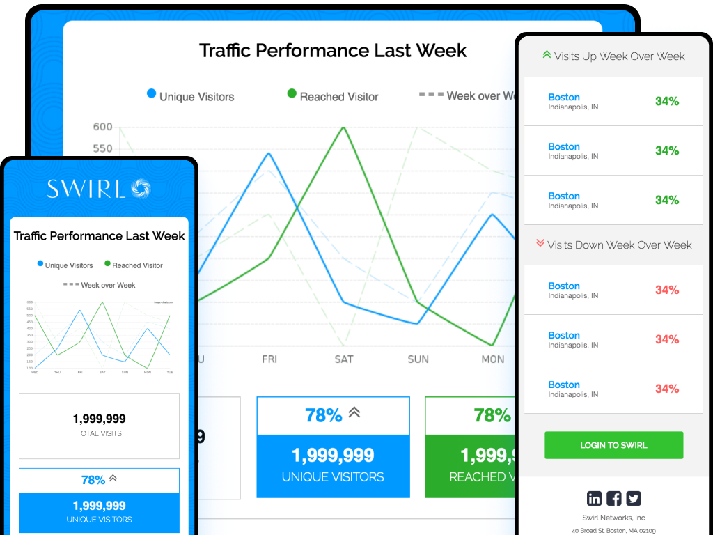
Bet two: dynamic charts via the Image Charts API. Rather than screenshotting the console and pasting a static image, the platform queried its own data at send time and encoded the results directly into an Image Charts URL — data values, labels, dimensions, and colors as URL parameters. The API returned a rendered chart image. That URL went straight into the MJML template as an <img src>. The recipient opened the email and saw a chart built from their actual numbers at the moment it was sent, not a two-week-old screenshot.
Click the chart, and the destination wasn’t a generic landing page — it was the console view that matched it, already scoped to the same time range and segment. What they saw in the inbox lined up with what they saw on screen.
The CTA-from-data swap took more convincing internally than the chart pipeline did. Live charts looked impressive; automating the call-to-action based on what those charts showed was the part stakeholders worried about. The answer was that the CTAs were data-driven, not data-generated — a lookup table mapped report signals to a curated set of next actions. The system never invented copy; it picked from copy a human had written.
What shipped
Three weekly digest reports, each scoped to a different audience need:
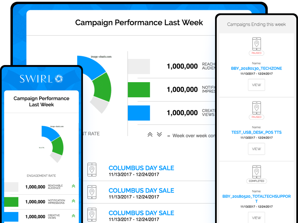
- Campaigns Overview — reach, impressions, and engagement across active campaigns for the week
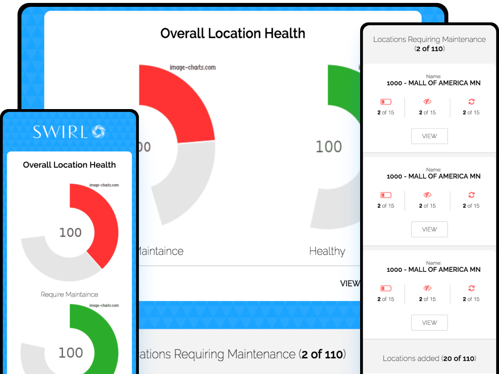
- BLE Location Health — beacon status across the fleet: how many healthy, how many require maintenance, coverage gaps
- InStore Traffic Performance — foot traffic patterns, dwell time, and store-by-store comparison
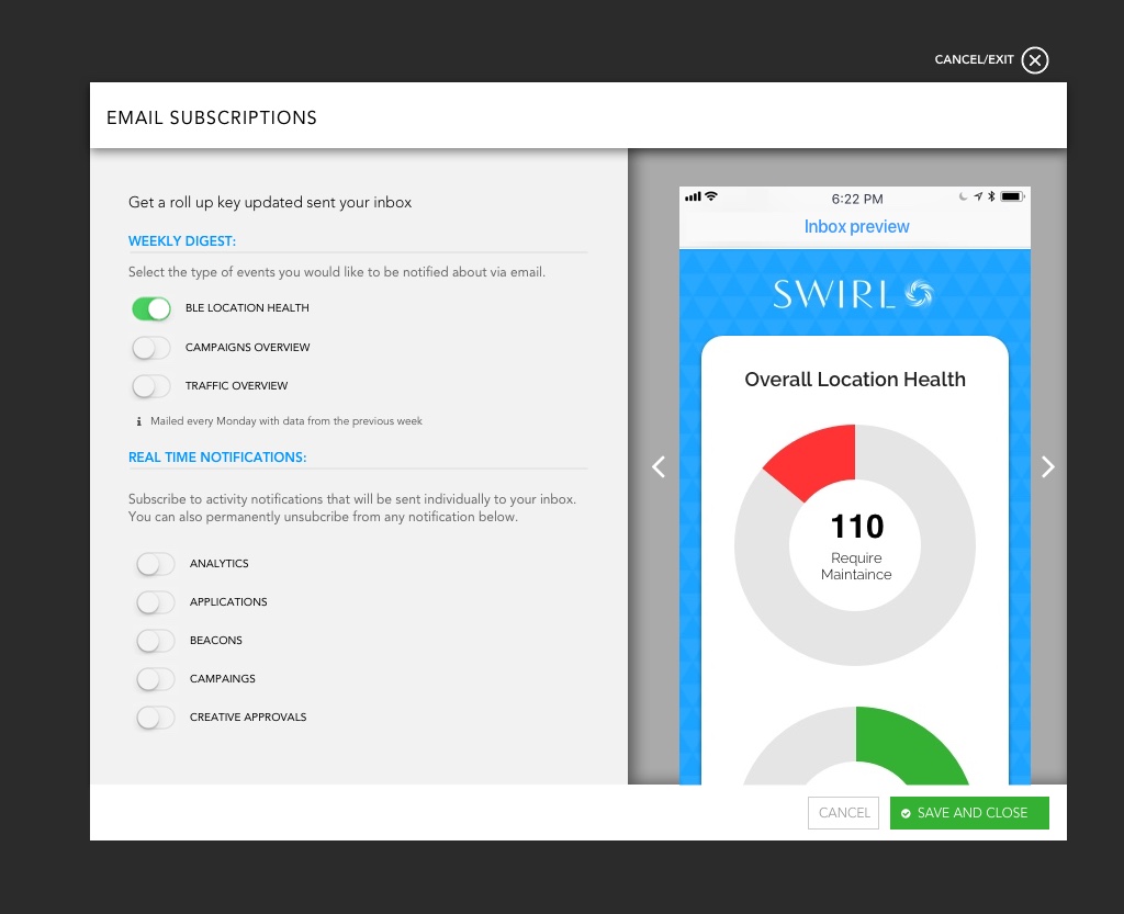
Each report mailed every Monday with data from the previous week. An admin subscription modal let each user toggle exactly which digests they wanted and preview what the email would look like before saving — the inbox preview rendered live in the modal.
What I’d take with me
The polish people associate with the app gets thrown out at the edges — login emails, notification emails, error pages, billing receipts. Those are the places the brand meets the user when the app isn’t open.
The Image Charts API made the chart generation almost trivially easy once the data pipeline was wired up — the complexity was deciding which data to surface and what a marketer should do next. The engagement numbers moved. But the more durable lesson was that the design system should run all the way to the edges. If the email feels like a different product, it’s because the team treated it like one.