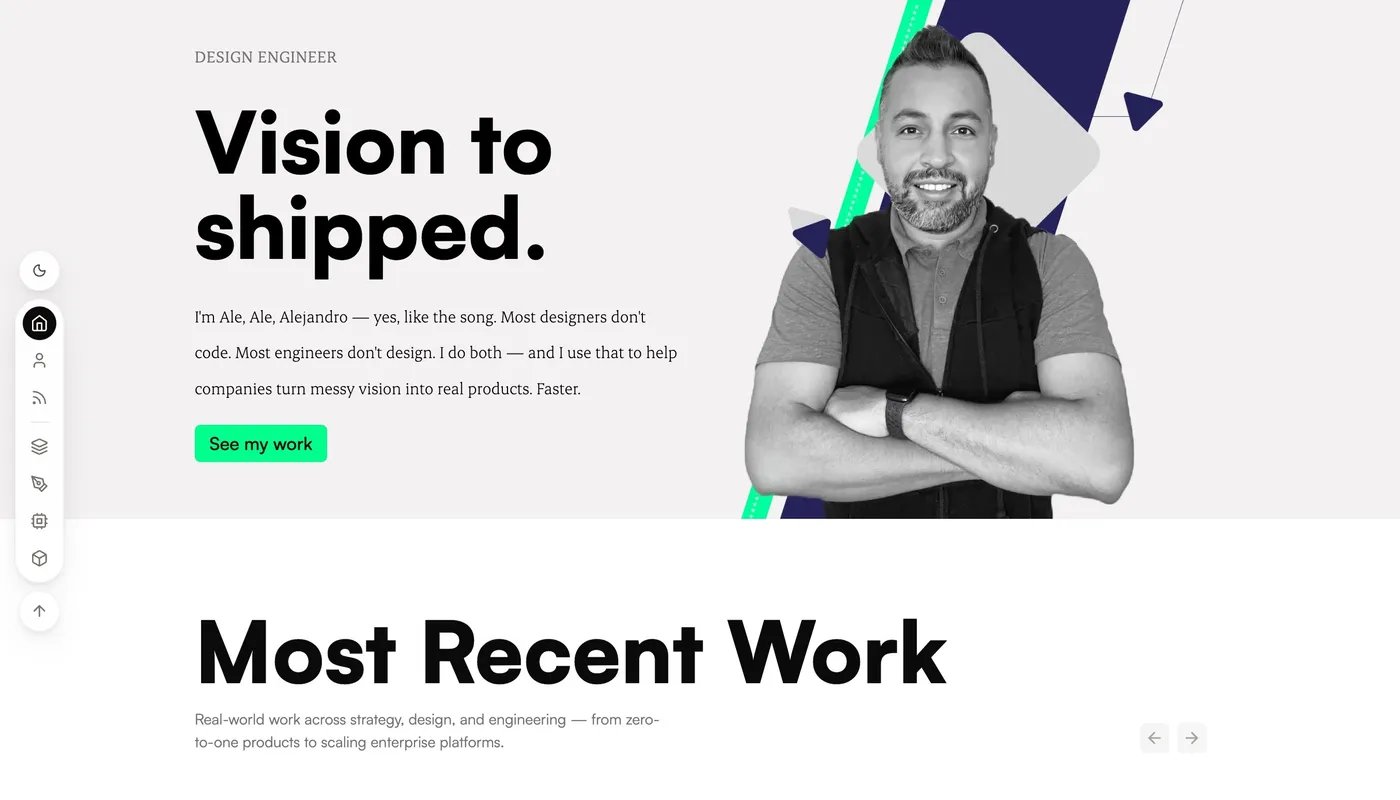
Progressive portfolio enhancements building in real time.
Role: Designer-engineer Project: Personal portfolio (Astro + React) Skills spotlighted: Design engineering, responsive interaction design, motion design
Outcome
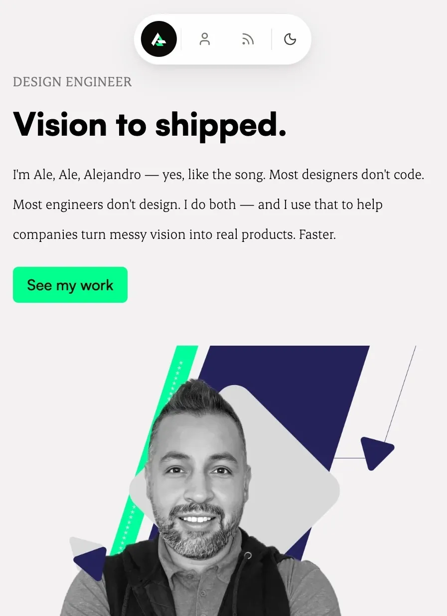
A floating dock replaced a header bar whose mobile hamburger opened nothing. Two responsive modes — a top-center pill on mobile, a slim left-edge sidebar on desktop — that hide while you read, surface topic shortcuts that deep-link to filtered work, and ship with a theme transition driven by the View Transitions API.
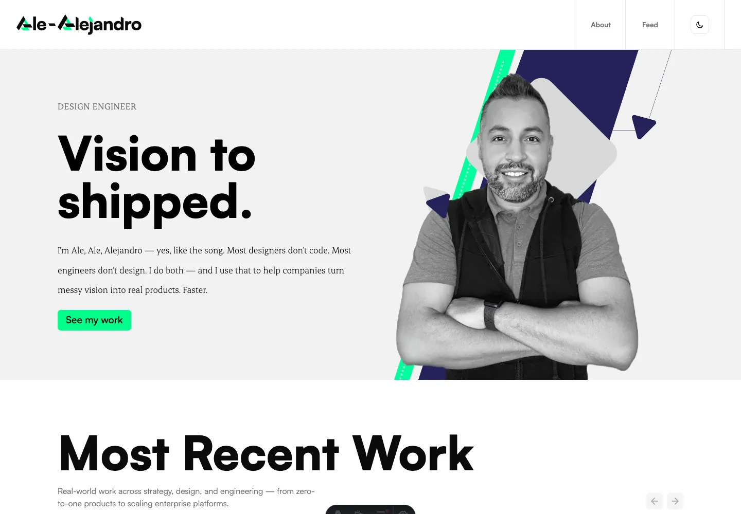
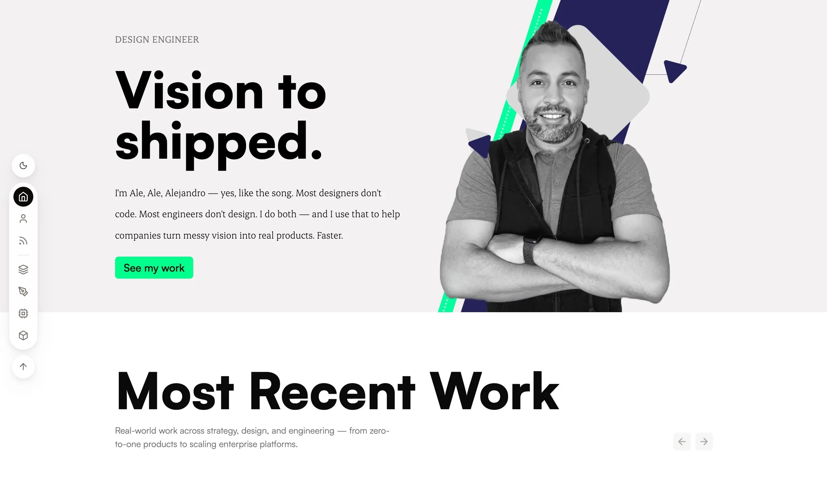
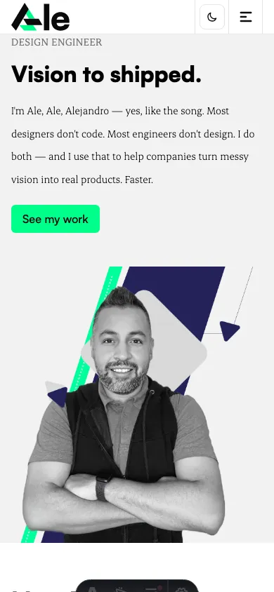
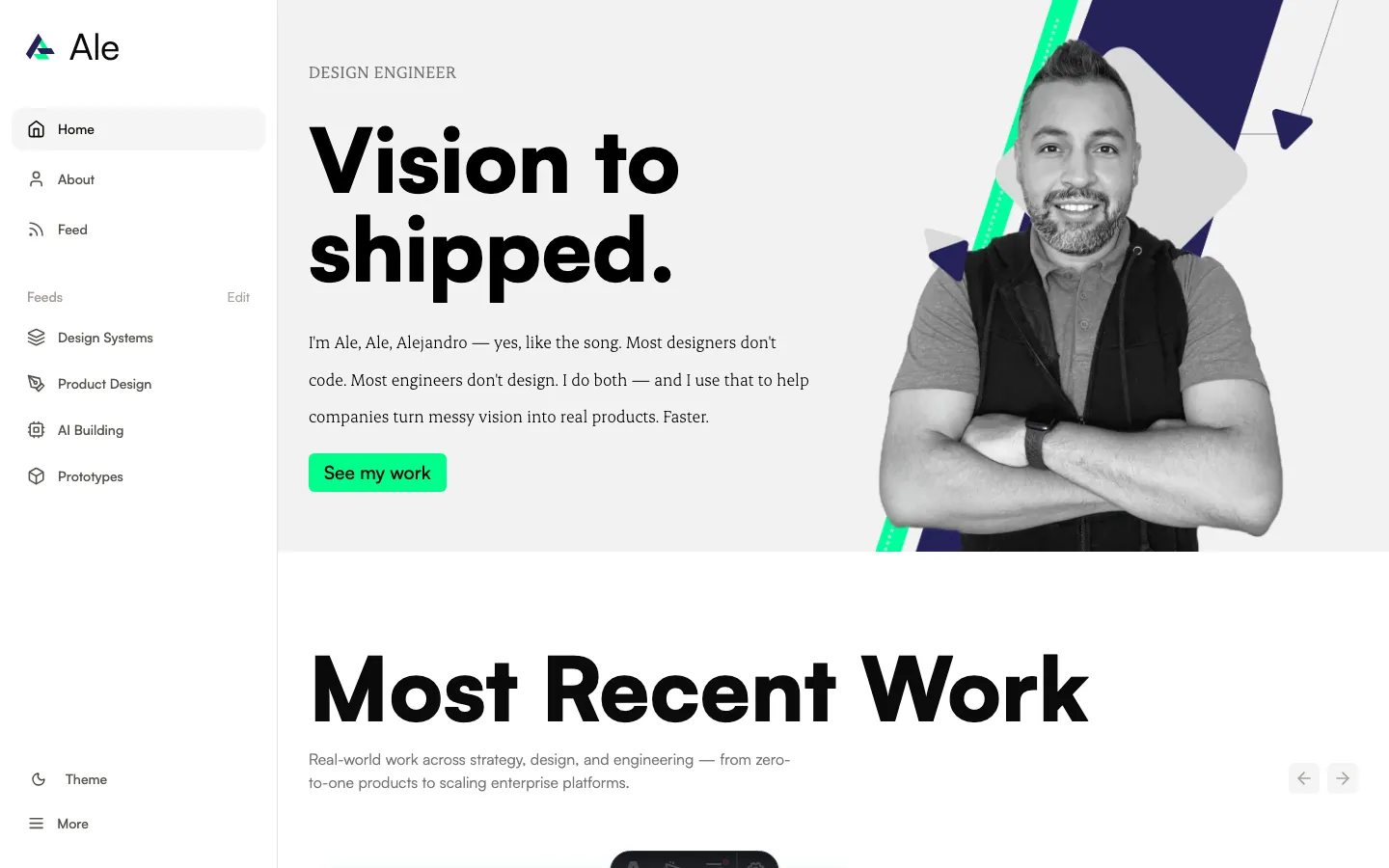
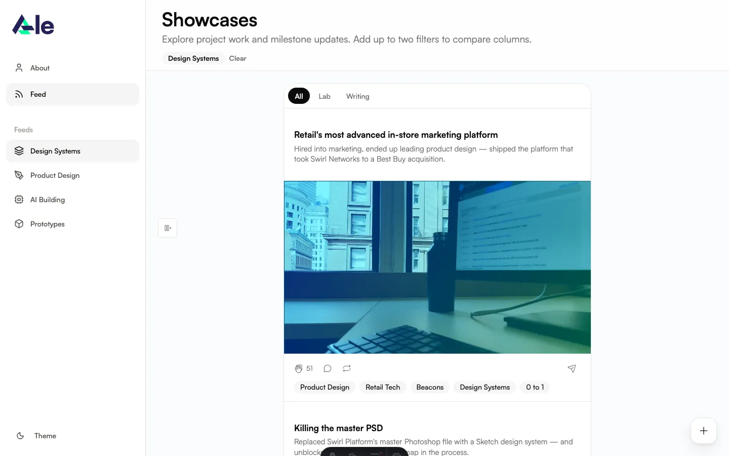
| Stage 1 — Top header | Stage 2 — Right dock | Stage 3 — Slim left dock (shipped) | |
|---|---|---|---|
| Mobile menu | Broken hamburger | Top-center capsule | Compact icon-only pill |
| Desktop chrome | 96px header eating the hero | Right-edge column, off the reading path | Single slim left-edge column |
| Wayfinding | One flat Feed link | Topic shortcuts present, but off to the side | Topic shortcuts where the eye enters |
| Theme toggle | Class swap | View Transitions reveal | View Transitions reveal |
Challenge
The shipped nav looked finished and worked on desktop. Three failures sat beneath:
- The mobile hamburger didn’t open anything. It rendered. It depressed on tap. It led nowhere.
- The header ate viewport. 96px tall on desktop, pushing “Vision to shipped.” below the fold on shorter laptops.
- No wayfinding into the work. Every project sat under one flat Feed link, with no way to signal what was inside.
Constraints: static site (Astro), but the nav needed real-time behavior (scroll-hide, theme transitions), so it had to be a client-loaded React island. Subframe is sync-managed under src/subframe, so project-owned components live outside that folder.
Process
Three stages, two pivots
The dock didn’t arrive in one move. It took two course-corrections — each driven by a different failure of the previous shape.
The first pivot — from header to dock
The plan was small: wire up a slide-down menu, ship it, move on. Forty minutes in, I realized I was about to ship a marginally better version of the same wrong thing. A drawer would fix the broken interaction, but the bar would still eat 96px of viewport, desktop would still be a wall of text links, and the topic problem wouldn’t move.
I stopped. New file: src/components/nav/DockNav.tsx. New question: if the nav weren’t a header, what would it be?
Mobile needed something compact and thumb-reachable. Desktop had dead vertical edge space the header wasn’t using. Both modes needed to get out of the way while reading. That shape is a dock.
The second pivot — from right edge to left, kept slim
My first dock landed on the right edge. The logic seemed sound: keep controls out of the reading path, the way OS chrome (Finder sidebar, file tree, IDE rails) sits off to the side. It shipped. It worked. But it parked the navigation on the side the eye reaches last.
Reading runs left to right. The eye enters every page from the left and ends on the right. A right-edge dock put the topic shortcuts — the whole point of the rebuild, the wayfinding into the work — in the spot a reader looks at only after they’ve finished scanning. The nav was technically present and effectively invisible. It also meant the first thing on screen was a wall of content with no signposting, and the signposting only when you’d given up looking.
The fix was two moves at once:
- Move to the left edge. Where reading begins. The dock now sits in the eye’s natural entry point, so wayfinding is the first thing a reader can act on — not the last.
- Keep it slim. The earlier instinct to slim the chrome stays: a single thin column of small icon buttons, not a heavy stacked rail. On the left edge slimness matters even more — a fat left rail would crowd the content and read like a 2018 SaaS dashboard. Thin enough to guide, light enough to stay out of the way.
Decisions and tradeoffs
Two layout shells, one component. A horizontal mobile pill and a vertical desktop sidebar solve different problems (mobile = reach, desktop = real estate). DockNav.tsx houses shared primitives (DockLink, ThemeDockButton) and composes them into two distinct shells, swapped at the md breakpoint — not one container morphing with five conditionals.
Hide on scroll-down, return on scroll-up. I know hide-on-scroll has costs: keyboard users scrolling to orient lose the nav, and motion-sensitive readers can find it twitchy. I weighed those against the cost of a floating dock that competes with the reading on every page. Mitigations: focus on any nav link forces the dock visible, useReducedMotion disables the animation entirely, and the dock returns the instant the scroll direction reverses (12px threshold, RAF-throttled, three states: top / up / down).
Icon-only on desktop, text on mobile. Costs discoverability and is fragile on touchscreen laptops. The bet: desktop visitors are mouse-first, tooltips appear on hover and keyboard focus, and the mobile pill uses text labels for the touch case. If discoverability shows up as a real problem, the fix is small — icon plus 11px label.
Topic shortcuts deep-link to a filtered feed. Each shortcut routes to /feed/?topic=design-systems. The feed page already filtered on the query param, so the nav surfaced filtering that was already there.
Iteration
The first mobile build broke the homepage. The fixed pill at top: 16 overlapped the hero headline because the old header used to provide top padding the hero relied on. A Playwright screenshot diff caught it; pt-20 lg:pt-0 on the hero fixed it.
The first theme toggle was a class swap. It felt cheap. I rebuilt it with the View Transitions API — a circular clip-path expanding from the button’s center to fill the viewport in 700ms, with an instant fallback in unsupported browsers. Same outcome, but the transition does the work of telling you something just changed across the whole page.
[INTERACTION PLACEHOLDER: 6-second loop of the theme toggle's circular reveal, dark→light and light→dark]
Solution
Mobile pill (< md)
Compact rounded capsule pinned to top-center. Custom Ale logomark as home on the left, then a small row of icon-only buttons (About, Feed, theme toggle) — no text labels at this size. Backdrop-blurred. Hides on scroll-down via a Framer Motion spring.
Desktop slim dock (md+)
A single thin column of small circular icon buttons pinned to the left edge, vertically centered — where left-to-right reading begins. Theme toggle on top, then primary nav (Home, About, Feed), topic shortcuts (Design Systems, Product Design, AI Building, Prototypes), and back-to-top at the bottom — all icon-only, all with tooltips that open to the right on hover and keyboard focus. The slim form keeps the dock present without crowding the reading column, and the homepage hero and feed filter were given extra horizontal padding so the dock never overlaps their content.
[INTERACTION PLACEHOLDER: 10-second loop — scroll-hide on scroll-down, return on scroll-up, topic-shortcut click jumping to a filtered feed, hover-reveal tooltip]
Engineering grain
useScrollDirectionhook: three states, 12px threshold, RAF-throttled- Custom SVG logomark mixing
currentColor(theme-reactive) withhsl(var(--primary))(brand accent) - Subframe Feather icons for the rest
- Framer Motion springs (
stiffness: 420, damping: 34) useReducedMotionhonored — animations disable for motion-sensitive users<nav aria-label="Primary">on both modes,aria-current="page"on the active link,focus-visiblerings on every interactive element
Impact
Homepage, current build (May 2026)
| Metric | Value | Tool |
|---|---|---|
| Lighthouse Performance (mobile) | 76 | lighthouse --form-factor=mobile |
| Lighthouse Accessibility | 96 | same |
| Lighthouse Best Practices | 100 | same |
| Cumulative Layout Shift | 0 | Lighthouse |
| Total Blocking Time | 0 ms | Lighthouse |
| Largest Contentful Paint | 5.9 s | Lighthouse (mobile-throttled) |
DockNav.tsx bundle |
5.66 KB gzipped (18.7 KB raw) | gzip -c dist/_astro/DockNav.*.js |
| Total site JS | 203 KB gzipped (577 KB raw) | find dist -name "*.js" |
| axe-core violations | 1 (color-contrast, serious) |
axe-core 4.11 in headless Chrome |
| axe-core passes | 35 rules | same |
The one a11y violation is a p.text-sm.tracking-wide element on the homepage (neutral-500 on neutral-100, ratio 4.24 — below the 4.5 WCAG AA threshold). It’s outside the dock itself; the fix is a one-token contrast bump in the homepage copy. CLS 0 and TBT 0 confirm the scroll-hide animation and theme transition don’t shift layout or block interaction.
Structural shifts
- Hero headline now sits at the top of the viewport — no header tax.
- One component (
DockNav.tsx) replacesNav.astro, the dead hamburger, and the inline theme toggle. useScrollDirectionis portable — reusable for any future floating UI on the site.
What I’d do differently
- I left the old
Nav.astro,Logo.astro, and originalThemeTogglein the repo for a “later cleanup pass.” That cleanup is still pending. I should have deleted them in the same PR; dead code creates ambiguity about which component is current. - I hardcoded the nav items inside
DockNav.tsxinstead of reading from the existingsrc/data/navData.js. That breaks the pattern the rest of the site uses. A small refactor I owe.
Reflection
The smallest fix isn’t always the right fix — and the first redesign isn’t always the right one either. I sat down to wire a hamburger; forty minutes later I scrapped it for a dock. I shipped that dock on the right edge feeling done; days later I moved it to the left edge, slim, because that’s where reading starts and where wayfinding should be. The “out of the way” instinct had quietly buried the most useful part of the nav. Each course-correction cost time. Each one moved the dock closer to the shape that actually serves the reading instead of competing with it.
The dock also taught me something about responsive design. The standard playbook (one component, breakpoint classes, hide-this-show-that) works when desktop and mobile are the same idea at different sizes. When they’re solving different problems, two shells sharing primitives beats one container with five conditionals.