Outcome
Every article on this site opens with a hero, and there are eight ways to build one. Not eight components — one discriminated union with five variants, three of which are layout options on the busiest variant. The choice is made once per piece, in frontmatter, and the type system refuses the combinations that don’t mean anything.
Eighteen pieces have now made that choice explicitly. Fourteen picked the arrangement that puts nothing on top of anything.
That number is the finding. I built the dramatic option first and it lost.
Challenge
An article hero has four things to place: a category chip, a title, a description, and an image. That’s it. The interesting part is that those four things have genuinely different relationships depending on where the image came from.
When you commission the image, you can put the text on top of it. You control the composition — you know where the quiet region is, you know it’s dark enough for white type, you know nothing important sits under the headline.
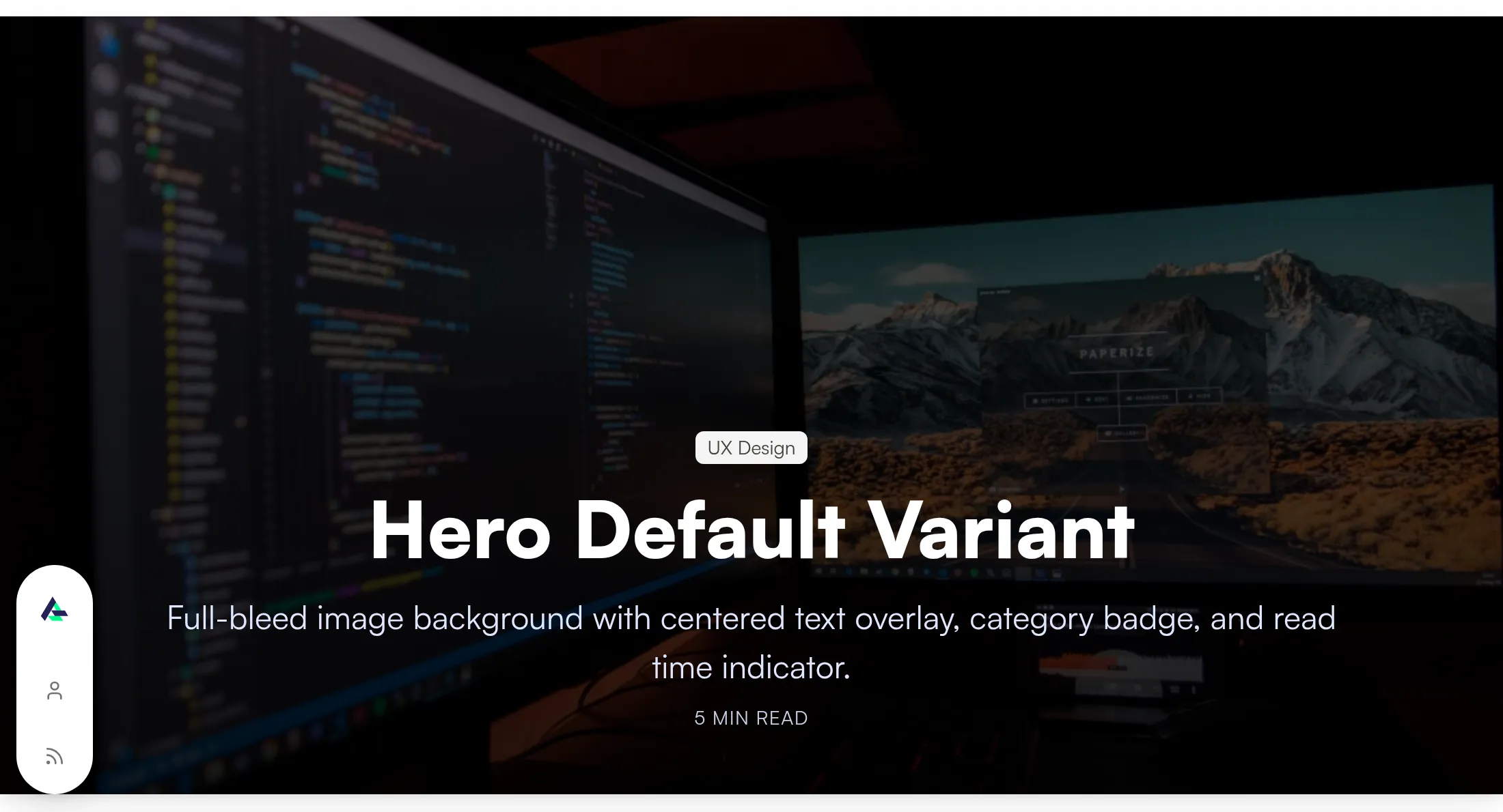
When the image is a screenshot of software you shipped, you control none of that. It has a UI in it. It has text in it. Its tonal range is whatever the product’s tonal range was. Put a display headline over that and you are gambling that the crop is kind.
Most of the images on this site are the second kind.
Solution
Four arrangements, same four things
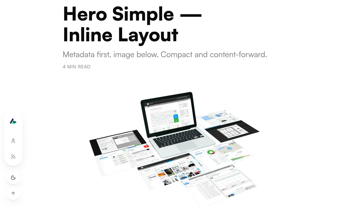
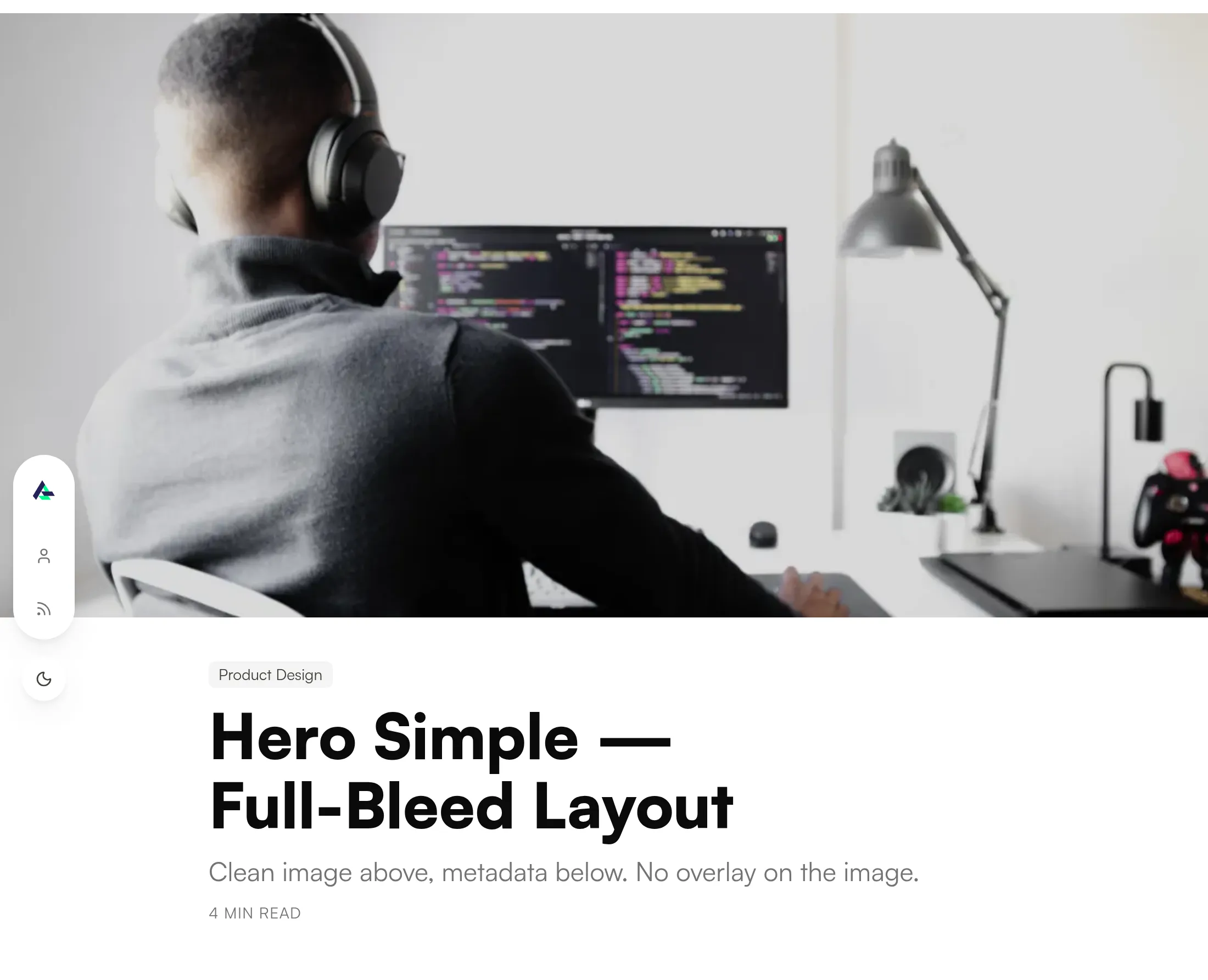
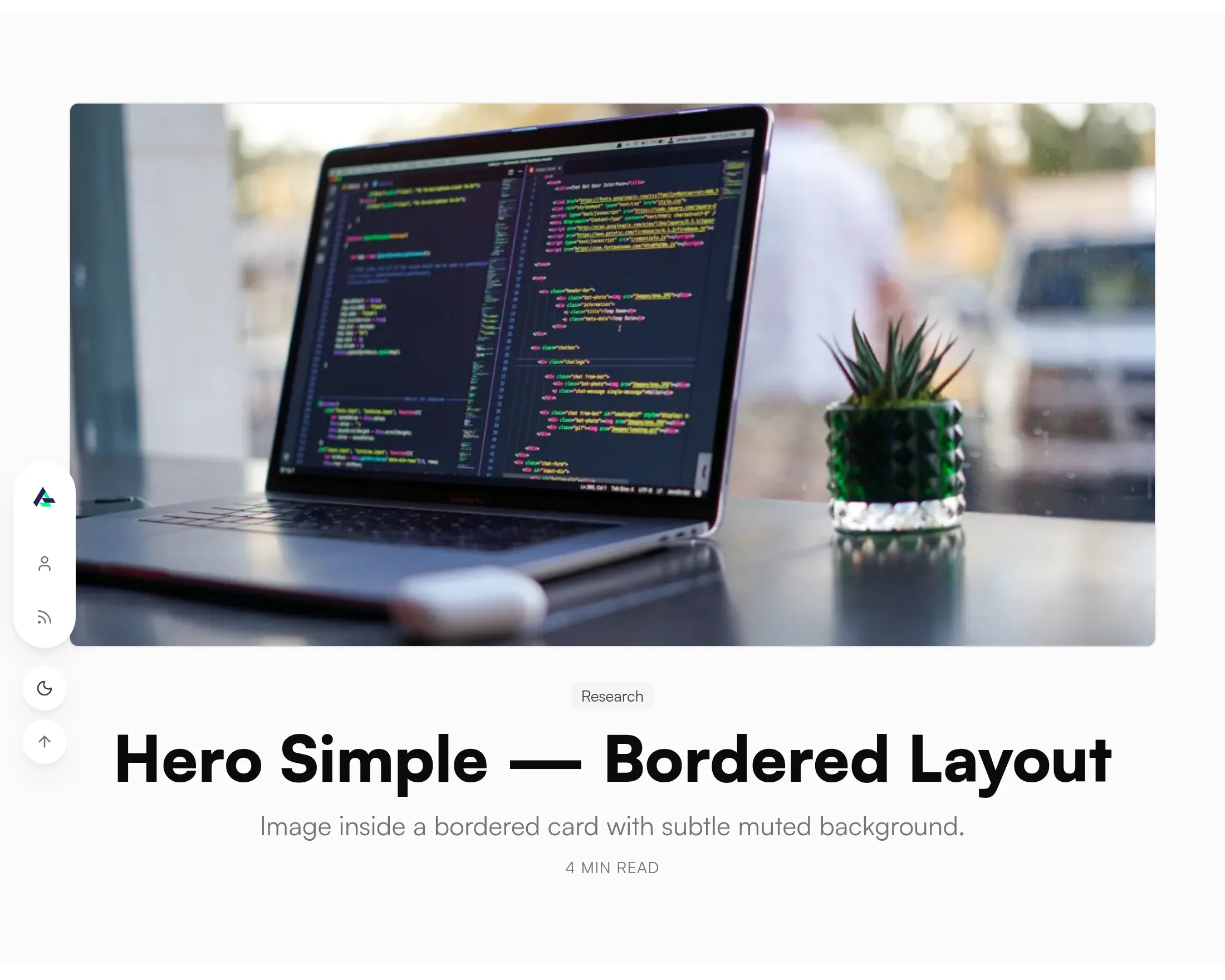
All four below render identical sample content at 1100px. The only variable is where the pieces sit relative to each other.
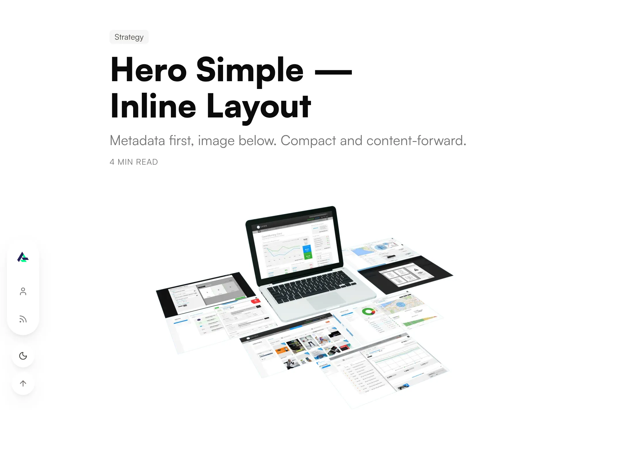
The union does the refusing
The arrangement isn’t a set of independent flags. It’s a discriminated union in
src/content.config.ts, keyed on variant, and the shape of each branch is
different:
simpletakes alayoutoffull-bleed,borderedorinline, and an optional image that falls back to the entry’s card image.videotakes asrcand nolayout— there is no bordered video hero, so the type won’t let you ask for one.alignedtakes an array of two or three images. Not one, not four. A two-image comparison and a three-image triptych are compositions; a four-image one at this width is a grid, and a grid is not a hero.scrolltakes an optional YouTube id and a title override.
Omit hero entirely and you get the overlay default. That fallback matters for
the numbers below: the pieces using the overlay are the ones that never made a
choice.
What eighteen choices actually said
Across 21 published entries:
| Arrangement | Pieces |
|---|---|
simple · full-bleed |
6 |
simple · bordered |
5 |
simple · inline |
3 |
(no hero block → overlay default) |
3 |
video |
2 |
scroll |
1 |
aligned |
1 |
Fourteen of the eighteen explicit choices are simple — the family that
separates the words from the picture. Every single overlay on the site is an
entry that didn’t opt into anything.
I want to be precise about what that does and doesn’t prove. It isn’t that the overlay is a worse composition; it’s the strongest one when it works. It’s that its precondition — an image whose quiet region you control — is false for almost everything I have to show. A hero that only composes well with commissioned photography is the wrong default for a portfolio whose images are screenshots of enterprise software.
The default is still the fallback for anything that doesn’t declare, which is now the part I’d change.
What I’d do differently
Make inline the fallback, not the overlay. Three published pieces are
currently opening with the one arrangement the evidence says to avoid, purely
because nobody typed a hero block. The fallback should be the arrangement that
can’t fail: words first, image below, no assumptions about the image at all.
Stop calling the busiest one “default.” The name has been doing quiet
advocacy for two years. overlay describes what it is; default describes what
it wins by walking over.
The bar I’d set for the next variant: it earns a place only if it makes a
composition that’s currently impossible, not one that’s currently inconvenient.
aligned cleared that — a side-by-side comparison genuinely can’t be expressed
as one image. A fifth simple layout would not.